Create a Tailwind CSS theme
In this guide, we’ll walk through the process of creating a custom Tailwind theme for your forms and inputs. Tailwind has risen to the forefront of CSS utility class libraries, and FormKit was authored with its capabilities in mind. Let’s get started!
This guide assumes you are using a standard Vue 3 build tool like Vite, Nuxt 3, or Vue CLI that will allow you to import .vue single file components.
Inline usage
Inline usage can be great for one-offs overrides or very simple forms. For full theme creation keep reading.
In the context of a .vue file that represents a component, it's possible to create a Tailwind theme using the section-key class props or the classes prop provided by FormKit.
If your component represents your entire form and your project only requires a single form, this may be all that you need. Here is an example of applying the same Tailwind classes to a FormKit text input using both the section-key props and the classes prop:
import { FormKit } from '@formkit/react'function TailwindThemeInlineUsageExample() { return ( <> {/* using section-key class props */} <FormKit type="text" label="Section-key class props" help="Look, Ma! Tailwind styles" outerClass="mb-5" labelClass="mb-1 block text-sm font-bold" innerClass="mb-1 max-w-md overflow-hidden rounded-lg border border-gray-400 focus-within:border-blue-500" inputClass="h-10 w-full border-none px-3 text-base text-gray-700 placeholder-gray-400" helpClass="text-xs text-gray-500" /> {/* using the classes prop */} <FormKit type="text" label="Classes prop" help="Look, Ma! Tailwind styles" classes={{ outer: 'mb-5', label: 'mb-1 block text-sm font-bold', inner: 'mb-1 max-w-md overflow-hidden rounded-lg border border-gray-400 focus-within:border-blue-500', input: 'h-10 w-full border-none px-3 text-base text-gray-700 placeholder-gray-400', help: 'text-xs text-gray-500', }} /> </> )}This is a low-barrier way to apply Tailwind styles to your FormKit forms, but what if you have multiple forms — or you need to handle a large variety of inputs? Copy-pasting class lists between components is not ideal and will lead to inadvertent variations in styling across your project over time.
Let's explore how we can create a Tailwind theme — with configurable options — that can cover all inputs in your project at a global level.
Creating a configurable FormKit theme
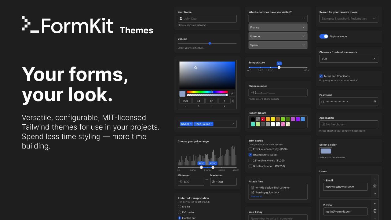
By following the instructions below we will create a theme like the ones available at https://themes.formkit.com. This includes support for user-configurable variables if you choose to provide them.
Once your theme is complete you can submit your theme to be included on https://themes.formkit.com by opening a PR against the site repo. Once approved it will become available for anyone else to use in their project via the CLI or web UI.
Initialize a copy of the starter theme
FormKit provides a starter theme — which comes with structural styles and plentiful comments — that is intended to help new authors cerate their own themes.
To get started, run the following command in your terminal:
npx formkit@latest create-theme
This will download a clean copy of the starter theme for you to work off of. The starter theme is a fully functional Vite application that includes a "Kitchen Sink" to help you see how your classes affect every available FormKit input.
Next, you will need to log in at https://pro.formkit.com and create a new (free) development key for FormKit Pro. This key will allow you to render the FormKit Pro elements that are included in the Kitchen Sink.
Add your FormKit Pro key to a .env file in the root of your project
FORMKIT_PRO_KEY=fk-**********
Once you've added your pro key, run the following commands to begin work on your theme:
# or npm or yarn
pnpm install
pnpm dev
The anatomy of the starter theme
The src directory in the starter theme contains the following important files and directories:
theme.ts: This is the entry point for your theme. It is where you will configure your theme's metadata, variables, and import your theme's CSS class lists for each input.meta: The meta information such as the theme name, supported inputs, and declarations for light mode and dark mode support.variables: The variables that will be used in your theme's CSS class lists — variables that are assigned an 'editor' will expose UI controls for theme users in the theme editor. More on this below.inputs: An object of input names each mapped to an object of section names and class lists. By default the class lists for each input are done as separate imports.
globals.ts: This file contains global classes for inputs. Any matching section name (eg, 'outer') will be applied to every FormKit input. A time-saver, but use with caution.familes/*.ts: One step higher in specificity than global classes, these files contain class lists for each input family. Families are groupings of similar inputs where sharing of styles makes sense — for example, the 'text' family includes 16+ inputs supported in FormKit. Each family file contains a comment at the top with a list of inputs that are included in that family.inputs/*.ts: The most specific class lists for each input. These classes apply only to the input indicated by the file name (assuming you have assigned them correctly in your theme.ts, which is done for you by default). When applicable, these files include a comment indicating which family they inherit classes from.
The remaining files in the starter theme can be ignored (but not removed) as they are scaffolding for the included Vite application and the Kitchen Sink. They will have no material effect on your published theme.
Working with variables
Variables are a powerful way to re-use values across your theme and to allow theme users to customize your theme to their liking. Variables are used in your inputs' class lists via the following syntax:
// global.ts
export default {
  outer: `$myVariable`,
}
The starter theme comes with many variables predefined.
Basic variables
The following variables are defined for convenience in the starter theme but do not expose any UI for theme users:
accentColoraccentColorStrengthaccentColorStrengthDarkcolorTemperaturecolorTemperatureStrengthcolorTemperatureStrengthDarkinputMaxWidth
The starter theme also ships with the following variables that expose UI controls for theme users:
radius,spacing,scale
You can create your own basic non-user-configurable variables by providing a new key/value pair in the variables object:
export default createTheme({
  ...
  variables: {
    ...
    textSize: 'lg'
  }
})
Variables can be used in your input's class lists using the following syntax:
// globals.ts
export default {
  // becomes 'text-lg'
  label: 'text-$textSize',
}
Putting shared common values into variables allows theme authors to quickly adjust values across all class lists in their theme from a single location.
Variables with scales
One of the best aspects of Tailwind is that all values operate on predictable scales. This means that we can provided a "range" for a variable and then move up and down the scale as needed within our theme.
For example, a spacing variable might operate using the following Tailwind scale (0, px, 0.5, 1, 1.5, 2, 2.5, 3 etc). By providing a scale and default value we can give ourselves the ability to step up and down the scale at will.
spacing: {
  value: "2",
  // We can define a scale that we can step through.
  // The default value will be used as the starting point.
  // Because we are defining the scale we can omit default
  // Tailwind values like '0' and 'px` if they don't make
  // sense for our use case.
  scale: ["0.5", "1", "1.5", "2", "2.5", "3", "4", "6"]
},
With the above variable defined we can now dynamically step up and down the scale in our class lists with the following syntax:
// globals.ts
export default {
  // becomes 'mb-3' — two steps up our scale
  outer: 'mb-$spacing(2)',
  // becomes 'mb-2' — our default scale value
  label: 'mb-$spacing',
  // becomes 'mb-1 — two steps down our scale'
  help: 'mb-$spacing(-2)'
  // a mix of mulitple values using the same variable
  // becomes 'mb-1 px-3 py-2'
  inner: 'mb-$spacing(-2) px-$spacing(2) py-$spacing'
}
Variables can never exceed the limits of their scales, so mb-$spacing(100) would become mb-6 as that is the upper bound of our provided scale.
Variables with user-controllable values
Variables are cool — but the real power comes from exposing variables to end-users of our theme and allowing them to configure the values to their own liking.
To do this we provide an editor value for our variable. The editor determines which UI control is exposed in the theme customization panel. The available editor values are as follows:
buttons: A set of buttons in a group used to select a value. Theme authors must provide their own scale.color: A set of swatches each representing a default Tailwind color. By default includes a scale of all 22 available Tailwind colors.fontSize: A set of buttons with the letterAin different sizes. By default includes a scale fromxsto9xl.radius: A set of buttons each depicting a different intensity of border radius. By default includes a scale fromrounded-nonetorounded-full.shadow: A stepper with a depiction of the selected shadow level. By default includes a scale fromshadow-nonetoshadow-2xl.spacing: A slider with a range of values with depictions of tighter spacing at the beginning and wider spacing at the end. By default includes a scale from0to96.select: A standard HTML select list that can contain any number of values. Theme authors must provide their own scale.
You can see an example of each of these editor values by viewing the editor UI for the Regenesis theme here.
We can update our spacing variable to use an appropriate editor:
spacing: {
  editor: "spacing",
  value: "2"
}
Now we will see a new control in the theme editor for our spacing variable with a slider that allows us to go from 0 to 96 as we step through the default Tailwind scale.
When you expose a variable, users are changing the base value when they modify a variable. This means that variable usage such as mb-$spacing(1) is always one step on the scale above the user's selected value, not the theme's default value.
Setting min and max for user-controlled variables
In most cases it makes sense to constrain the available scale for a user-configurable variable. Allowing our users to adjust spacing is great, but we probably don't want them to be able to crank the value all the way up to 96 or all the way down to 0. We can constrain the range of the scale that is available to a user by using the min and max properties on our variable.
spacing: {
  editor: "spacing",
  value: "2",
  min: "1",
  max: "3"
}
This means that our spacing variable will now only allow values 1, 1.5, 2, 2.5, and 3 to be selected by using via the customizer UI.
Creating one-off min and max constraints
Sometimes as a theme author you need to clamp or expand available values beyond what is defined in a variable's default min and max definition. You can do this by passing additional min and max arguments to inline instances of a variable.
The provided values for min and max must be values or the variables associated scale — whether that is a default scale for an editor or a custom scale defined by the theme author.
You can also provide a wildcard * symbol as the 2nd argument to allow any valid value on the associated scale.
// globals.ts
export default {
  // steps up 5 steps on the scale.
  // sets the min value to 3
  // and the max value to 8
  outer: 'mb-$spacing(5, 3, 8)',
  // steps down 2 steps on the scale
  // sets the minimum value to 1
  // and the max value to 2
  label: 'mb-$spacing(-2, 1, 2)',
  // steps down 2 steps on the scale
  // allows any valid value on the scale
  help: 'mb-$spacing(-2,*)',
}
Overriding default editor scales
Some editor types such as scale or color come with default scales. However, we can override the defaults by providing a custom scale property.
accentColor: {
  editor: "color",
  value: "blue",
  // excludes all "gray" colors
  // from the default scale
  scale: [
    "red",
    "orange",
    "amber",
    "yellow",
    "lime",
    "green",
    "emerald",
    "teal",
    "cyan",
    "sky",
    "blue",
    "indigo",
    "violet",
    "purple",
    "fuchsia",
    "pink",
    "rose",
  ],
},
You can even combine custom scales with min and max properties to create entirely new scales beyond the values that are available in the default Tailwind scales.
scale: {
  editor: "fontSize",
  value: "base",
  scale: [
    // a custom size and accompanying
    // custom line-hight for the size.
    "[11px] [line-height:1em]",

    // default values from Tailwind
    // in a range we find sensible.
    "xs",
    "sm",
    "base",
    "lg",
    "xl",
    "2xl",
  ],
  min: "sm",
  max: "lg",
},
There are many more comments in the @formkit/theme-starter theme itself to help you along your way as you work.
Publishing your theme
When you're done creating your theme you can use the included publishing script to build and publish your theme to npm.
First, ensure that you have modified the contents of your theme's meta key and package.json file to accurately reflect your theme's name, description, version, and author information.
It is recommended to name your theme with the prefix formkit-theme- to help users discover and understand that your package is a FormKit theme.
When you're ready, run the following command in your terminal
#pnpm highly recommended
pnpm release
This command builds your theme, runs a linter to ensure that your package.json is valid, runs a script to bump the version of your theme (and create release notes automatically if you're using semantic commit messages), and then publishes your theme to npm under your provided package name.
Installing a published 3rd-party theme
To use a third-party theme that you or someone else has published to npm, first install it as a dev dependency in your project:
pnpm add -D formkit-theme-my-theme
If you are using pnpm you will need to ensure you have the formkit command line package as a dev dependency in your project. If you are not using pnpm you can skip this step.
pnpm add -D formkit
Once the theme has been installed as dependency you can build your theme with the formkit CLI theme command.
# will resolve from your local node_modules
npx formkit@latest theme --theme=formkit-theme-my-theme
This command will produce a formkit.theme.(mjs|ts) file in your project's root directory. To complete the setup you will need to do the following two things:
- Import the
rootClassesfunction from your built theme into yourformkit.configfile - Add a
@sourcedirective for theformkit.themefile in your CSS
// formkit.config.ts
import { defineFormKitConfig } from '@formkit/vue'
import { rootClasses } from './formkit.theme'

export default defineFormKitConfig({
  ...
  config: {
    rootClasses,
  },
})
/* main.css (or your primary CSS file) */
@import 'tailwindcss';
@source "./formkit.theme.ts";
@source "./formkit.config.ts";
If you're using Tailwind CSS 3, add the theme file to your tailwind.config.js content array instead:
// tailwind.config.js
module.exports = {
  content: ['./app.vue', './formkit.theme.ts'],
}
Customizing the variables of a published theme
Need to change some of the available variables in your theme? This can be done by importing and overriding your theme in an intermediate file and then passing that intermediate file to the formkit CLI. For this example let's create a file called formkit.theme.config.ts in the root of our project. In this file we will import our theme and re-export it passing in variable overrides.
// formkit.theme.config.ts
import myTheme from 'formkit-theme-my-theme'

export default myTheme({
  // modify any variables that are available in your theme
  radius: 'rounded-full',
  spacing: '2.5',
  accentColor: 'violet',
})
Now you can use the formkit CLI to build your theme with your customizations applied.
# will generate your theme with your variable overrides
npx formkit@latest theme --theme=formkit.theme.config.ts
Install the resulting formkit.theme.(mjs|ts) file by following the same instructions from the section above — adding the rootClasses to your formkit.config file and including the formkit.theme.(mjs|ts) file via @source directives in your CSS.
Submitting your theme to themes.formkit.com
Proud of your theme? Offering something unique that other FormKit users would enjoy using?
Open a pull request against the themes.formkit.com repo and submit your theme! Once approved it'll be listed in the theme gallery and be available for anyone to use in their project as easily as the provided 1st-party FormKit themes.
# installable directly by name from themes.formkit.com once merged
npx formkit@latest theme --theme=my-theme
Getting help
Writing a comprehensive FormKit theme is a large undertaking. If you get stuck, need ideas, or otherwise want to talk about creating themes for FormKit be sure to join us in our official Discord community. We're happy to help!
Join FormKit on Discord