Styling
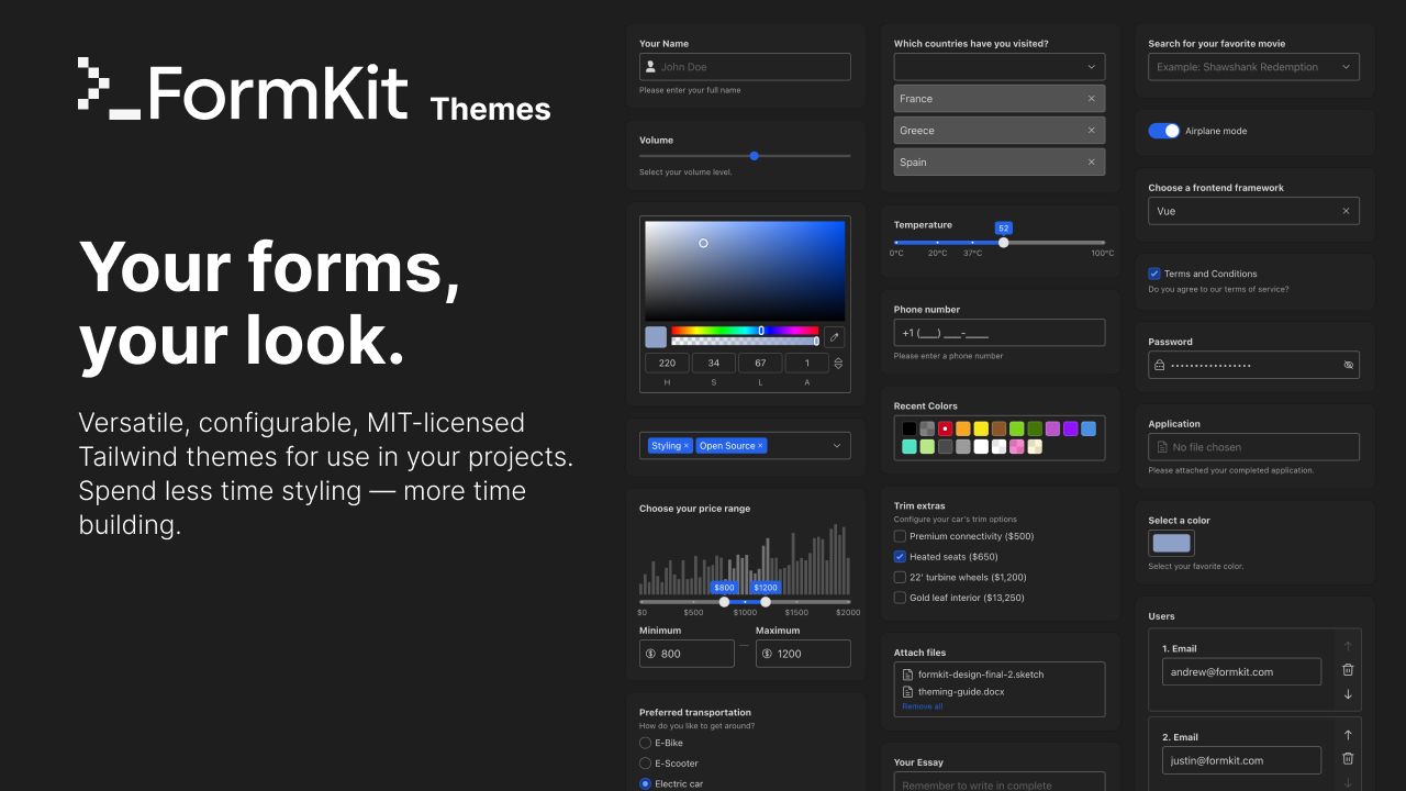
FormKit ships robust and accessible markup — but with no assumptions about your desired styles. FormKit provides optional themes you are welcome to use in your project — or you can create your own.
Tailwind CSS
Using the Web UI
The easiest way to get started with FormKit Tailwind Themes is to install the themes package and head to themes.formkit.com, customize a theme, and choose Download theme.
Using the CLI
Alternatively, you can use the FormKit CLI to select a theme for your project. Run the following command in the same directory as your formkit.config.{ts|js} file:
npx formkit@latest theme
This command will create a formkit.theme.{ts|js} file in the root of your project. To complete the setup you will need use the rootClasses from this theme file in your formkit.config.{ts|js}:
// formkit.config.ts
import { defineFormKitConfig } from '@formkit/vue'
import { rootClasses } from './formkit.theme'

export default defineFormKitConfig({
  config: {
    rootClasses,
  },
})
Finally, you'll need to add the formkit.theme.{ts|js} file to your CSS using a @source directive. This ensures Tailwind scans the theme file for class names to include in your CSS:
/* main.css (or your primary CSS file) */
@import "tailwindcss";
@source "./formkit.theme.ts";
@source "./formkit.config.ts";
If you're using Tailwind CSS 3, add the theme file to your tailwind.config.js content array instead:
// tailwind.config.js
module.exports = {
  content: [
    "./app.vue",
    "./formkit.theme.ts"
  ]
}
If you run the command again, you will be taken to https://themes.formkit.com where you can customize your chosen theme.
# with existing formkit.theme file in your project root
> npx formkit@latest theme
? Found local theme file for <themeName>, edit this theme? › (Y/n)
Building your own Tailwind CSS theme
Want to create your own Tailwind theme? Check out our starter theme — which is heavily commented — to get started. You can also follow our guide, "Create a Tailwind CSS theme" to follow along step by step through the theme creation process.
Additional styling overrides
Continue reading to learn how to further override the classes that ship with your chosen FormKit theme at global, form, and input levels.
Installing the legacy Genesis CSS theme
FormKit now ships much more configurable Tailwind themes available at themes.formkit.com. If you are using the legacy Genesis CSS theme then follow the instructions below — but we encourage you to consider using one of the new Tailwind powered customizable FormKit themes to make your life much simpler.
Eventually the legacy Genesis CSS theme will be deprecated and no longer supported by new Pro inputs.
CDN Usage
To load genesis via CDN, supply it to the theme property of your defaultConfig.
...
defaultConfig({
  theme: 'genesis' // will load from CDN and inject into document head
})
...
Direct import
To install Genesis, first install the @formkit/themes package.
npm install @formkit/themes
Then in your main.js (wherever you boot Vue up) include the Genesis theme.css (this assumes you are using a build tool like Vite, Webpack, Snowpack, or Nuxt):
import '@formkit/themes/genesis'
Outer attributes
For styling purposes some attributes are automatically added to and removed from the outer section of all FormKit inputs:
data-type— The type of input,text,select,checkboxetc.data-multiple— For inputs that accept themultipleattribute, this will be appended when the input has the multiple attribute (like theselectinput).data-disabled— Present when an input is disabled.data-complete— Present when the input is "complete". Intended to be used for styling the input when a user has completed filling out the input (like a green checkmark). Read aboutcontext.state.completefor information what conditions cause this to betrue.data-invalid— Present when the input has failing validation rules and the messages for the failing rules are visible.data-errors— Present when the input has explicitly set errors.
You can use the above attributes to easily provide realtime visual feedback for users filling out your forms:
<FormKit type="text" label="Email address" help="Enter a full email address" validation="required|email" validationVisibility="live"/><style>{` .formkit-outer[data-invalid] .formkit-inner { border-color: red; box-shadow: 0 0 0 1px red; } .formkit-outer[data-complete] .formkit-inner { border-color: red; box-shadow: 0 0 0 1px green; } .formkit-outer[data-complete] .formkit-inner::after { content: '✅'; display: block; padding: 0.5em; }`}</style>Custom classes
Most users will want to apply their own styles and classes to FormKit's provided markup. FormKit provides numerous methods to apply classes for your project.
Classes can be modified for all sections using any of the following methods (from highest to lowest specificity):
- The
{section-key}-classprops. (most specific) - The
classesprop. - The
classesconfiguration option. - The
rootClassesconfiguration function. (least specific)
The classes follow a strict hierarchy. Initially, classes are produced by the rootClasses function. They can then be modified by the classes configuration option, then by the classes prop, and finally by the {section-key}-class prop. At each of these stages classes can be appended, reset, or selectively modified.
Appending classes
To append a class, return the string you want to append, or provide an object of classes with boolean values — true properties will be appended:
<FormKit outerClass="i-will-be-appended" wrapperClass={{ 'i-will-append': true, 'i-will-not': false, }}/>Resetting classes
Classes produced by all earlier hierarchy steps can be completely removed by providing a special (not rendered) class $reset in either string format or object format:
<FormKit classes={{ outer: 'foo-bar', inner: { $reset: true, }, }} outerClass="$reset only-me-please"/>Removing classes
Classes produced by an earlier step in the class hierarchy can be selectively removed by providing an object with the value false for the class you want to remove or by providing a class name to a {section-key}-class prop that starts with $remove: and matches an existing class in the class list. This includes removing formkit's default formkit- prefixed classes:
<FormKit outerClass={{ 'formkit-outer': false, }}/><FormKit outerClass="$remove:formkit-outer" />In addition to the four methods listed above, more generalized overrides are also available, like overriding an input’s schema, using the classes node hook, or utilizing slots:
Section-key class props
The simplest way to modify the classes of an element inside a FormKit input is via the {section-key}-class props. To add a class to a specific section element, like label, you add the label-class prop:
In React JSX these props use camelCase like labelClass.
<FormKit outerClass="foo-bar" labelClass="$reset only-my-class" helpClass={{ 'add-this-class': true, 'dont-add-this': false, }} type="email" label="Email address" placeholder="[email protected]" help="Please enter you email address." validation="required"/>Classes prop
The classes prop is similar to the section-key class prop except it allows setting classes on all sections at the same time:
<FormKit classes={{ outer: '$reset my-class', help: { 'bg-red-500': true, }, }} help="Please enter your name above."/>Classes configuration
The classes configuration option is similar to the classes prop, except it applies to all inputs the configuration is applied to. FormKit's unique configuration system allows for you to apply classes globally on your project or just inputs within a certain group or form:
For app-wide styling this configuration usually lives in defineFormKitConfig(...) from @formkit/react. For scoped styling in React, the same configuration can also be passed through <FormKitProvider />.
Global class configuration
import { defineFormKitConfig } from '@formkit/react'export const formkitConfig = defineFormKitConfig({ config: { classes: { input: 'my-class', }, },})export default function App() { return null}Class configuration on a group, list, or form
<h2 className="text-xl font-bold mb-4">Account</h2><FormKit label="Your name" type="text" help="This input is not in the group, so it does not get classes applied"/><FormKit type="group" config={{ classes: { label: 'super-red', }, }}> <FormKit label="Street address" type="text" /> <FormKit label="City" type="text" /></FormKit>Account
Using generateClasses from @formkit/themes
FormKit ships with a helper function called generateClasses included in @formkit/themes.
The generateClasses function takes a javascript object keyed by input type with values of a sub-object keyed by ${sectionKey} with values of strings. With this function you can quickly apply class lists to sections within inputs based on a given inputs' type.
<FormKit type="text" /><FormKit type="email" />The rootClasses function
Themes provided from https://themes.formkit.com use the rootClasses function to apply their class lists. Overriding the rootClasses function in your project will effectively uninstall your Tailwind theme. Use generateClasses in your config object to apply overrides instead.
rootClasses is a configuration function that is responsible
for producing the default classes for each element. This function already has a default value which produces all the default classes (like formkit-outer and formkit-label) that ship with FormKit — so replacing this single function allows you to easily replace all initial classes. This makes it an ideal candidate for writing custom themes when using utility frameworks like Tailwind.
Like other config options, rootClasses can be supplied globally or scoped via your framework config. In React that typically means defineFormKitConfig(...) for app-wide behavior or <FormKitProvider config={...}> for a subtree.
The rootClasses function is passed 2 arguments (respectively):
- The section key (like
labelorinput). - The input’s node.
The function will be called once for each section and it must return an object of classes with boolean values.
While typical usage of rootClasses is at the global config level to apply
classes to your entire project - you can also use it with the config prop to override
a specific form or input within your project with a class list computed from the logic
within your provided function:
function rootClasses(sectionKey) { return { [`foo-${sectionKey}`]: true, }}function RootClassesExample() { return <FormKit config={{ rootClasses }} />}Because rootClasses is a configuration option, you can apply it per input, per group, or globally.
Modifying classes within schema
In addition to modifying classes via config or props on a <FormKit> component, you can use the same techniques within schema:
Section-key class props within schema
Within schema, you can also modify the classes of an element inside an input via the {section-key}Class properties. For example, to add a class to the label section, you can add the labelClass property:
{
  $formkit: 'text',
  name: 'email',
  // adds 'appended-class' to the "label" section
  labelClass: 'appended-class'
},
Classes prop within schema
Much like the classes prop on a <FormKit> component, you can modify the class list for any section of an input with the classes property on a schema node:
{
  $formkit: 'text',
  name: 'email',
  // modifies classes on both the "outer" and "inner" sections of this input
  classes: {
    outer: 'new-outer-class',
    inner: {
      $reset: true, // resets classes on the "inner" section
      'new-inner-class': true
    }
  },
},
Config within schema
Since config is passed down to descendant inputs, you can alter classes via config on a parent, such as a form, list, or a group, and this will affect all descendants to any depth:
import { FormKitSchema } from '@formkit/react'const schema = [ { $formkit: 'group', name: 'group', config: { outerClass: 'half' }, children: [ { $formkit: 'email', label: 'Email', }, { $formkit: 'email', label: "Your spouse's email", }, ], },]function ClassesConfigSchemaExample() { return ( <> <div className="wrapper"> <FormKitSchema schema={schema} /> </div> <style>{` .wrapper { display: flex; } .half { flex: 0 0 50%; padding-right: 10px; } `}</style> </> )}